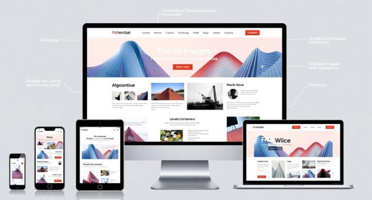
In today’s digital landscape, ensuring your website provides a seamless experience across a multitude of devices is more critical than ever. From smartphones and tablets to desktops and large monitors, each device presents unique challenges for web designers and developers aiming for consistent performance and appearance. Traditional design approaches often struggle to maintain uniformity, leading to issues like distorted layouts, slow load times, and poor user engagement. Enter Pxless Design—a revolutionary approach that addresses these problems head-on by simplifying and optimizing how websites adapt to different screen sizes and resolutions.
Understanding the Challenge of Website Scaling
Before delving into how Pxless Design offers solutions, it’s essential to understand the core issues associated with website scaling across devices:
- Responsive Design Limitations: While responsive design techniques like media queries and flexible grids have made strides, they often fall short when dealing with complex layouts or highly dynamic content. Devices with unusual aspect ratios or resolutions can still produce awkward or broken layouts.
- Performance Bottlenecks: High-resolution images, heavy scripts, and complex CSS can bog down websites, especially on mobile devices with limited processing power and slower internet connections.
- Inconsistent User Experience: Different devices may display content differently, leading to inconsistent branding, navigation difficulties, and user frustration.
- Maintenance Complexity: As websites grow, maintaining a consistent look across all devices becomes increasingly complicated, especially when multiple design breakpoints are involved.
Introducing Pxless Design: A Paradigm Shift
Pxless Design reimagines website scaling by fundamentally shifting how dimensions, layouts, and visual elements are handled. Instead of relying heavily on pixel-based measurements, Pxless Design emphasizes relative units, fluid layouts, and flexible components that adapt naturally to any screen size. This approach minimizes fixed breakpoints and enhances the website’s ability to scale smoothly across diverse devices.
Core Principles of Pxless Design
- Emphasis on Relative Units: Using units like
em,rem,%,vh, andvwinstead of fixed pixels allows elements to resize proportionally to their parent containers or viewport dimensions. This ensures that content scales gracefully without distortion. - Fluid Layouts: Rather than static grids, Pxless Design advocates for flexible containers that expand or contract based on available space. Techniques like CSS Flexbox and Grid are utilized to create layouts that inherently adapt to screen size changes.
- Minimal Breakpoints: Traditional responsive design often involves numerous media queries for different device widths. Pxless Design reduces reliance on breakpoints by creating inherently flexible designs that work well across a broad spectrum of sizes.
- Adaptive Content Scaling: Images, fonts, and media are scaled dynamically, preventing issues like oversized images on small screens or tiny text on large displays.
- Progressive Enhancement: Content is structured to adapt to device capabilities, ensuring that users on low-end devices still receive a usable experience, while those on high-end devices enjoy enhanced visuals.
How Pxless Design Solves Specific Scaling Issues
1. Eliminating Layout Breakage
By avoiding fixed widths and heights, Pxless Design prevents common layout breakages seen in traditional responsive sites. For example, using max-width: 100% for images and containers ensures they never overflow their parent elements, maintaining visual integrity across devices.
2. Smoothing Visual Transitions
Fluid units enable smooth transitions when resizing the browser window or switching devices. This eliminates jarring jumps or content overlap, creating a more polished experience.
3. Reducing Development and Maintenance Effort
Since Pxless Design reduces the need for numerous media queries, developers spend less time managing breakpoints and fixing layout issues. This streamlines updates and ensures consistency.
4. Enhancing Performance
Scaling elements proportionally reduces the need for multiple image sizes and media-specific assets. Coupled with modern CSS techniques, websites load faster and perform better on all devices.
5. Future-Proofing Websites
As new devices with unconventional aspect ratios and resolutions emerge, Pxless Design’s flexible approach ensures your website remains compatible without extensive rewrites or adjustments.
Practical Implementation of Pxless Design
Implementing Pxless Design involves adopting several best practices:
- Use Relative Units for Typography and Spacing: Replace
pxwithem,rem,%,vh, andvw. - Leverage CSS Flexbox and Grid: Build flexible layouts that naturally respond to viewport changes.
- Optimize Media Assets: Serve appropriately scaled images and media that adapt to device resolution and size.
- Limit Breakpoints: Design layouts that are inherently fluid, resorting to breakpoints only when necessary.
- Test Across Devices: Regularly test on various devices and screen sizes to identify and refine scaling behaviors.
Real-World Examples of Pxless Design Success
Many modern websites and applications are adopting Pxless principles, resulting in:
- Enhanced User Engagement: Users experience consistent, visually appealing interfaces regardless of device.
- Lower Bounce Rates: Seamless scaling reduces frustration, encouraging longer visits.
- Simplified Development Cycles: Less time spent managing breakpoints and fixing layout issues.
Conclusion
As the digital world continues to diversify with countless device types and screen sizes, traditional responsive design methods are increasingly insufficient. Pxless Design offers a forward-thinking solution by emphasizing fluidity, flexibility, and simplicity. By moving away from fixed pixel measurements and embracing relative units and adaptable layouts, Pxless Design effectively solves website scaling issues, delivering a superior user experience across all devices. Embracing these principles not only future-proofs your website but also streamlines development and maintenance, making it an essential approach for modern web design.
